Van-Go Mobile Tattoos & Piercings
Proposal
Tattoos and piercings are becoming more and more popular each year. Along with tattoos and piercings becoming more popular, after the pandemic consumers have started to expect businesses coming to them in comparison to consumers going to the business. To keep up with the rising popularity and meet consumer needs, many body modification companies have started to provide services at events such as weddings, festivals, and popular areas like boardwalks or other large social events.
Van-Go Mobile Tattoos & Piercings is a West Coast based company I created inspired by the recent influx of traveling tattoo and piercing shops. The name is both a play on the van the company travels in as well as the famous painter, pushing the idea of traveling body art.
They offer their mobile services at both public events and private events such as weddings or birthday parties. Along with that, they offer four aftercare products both in person and on their website as well as an aftercare guide with instructions and instructional material on their website. Their studio is housed in a state-of-the-art fully equipped trailer that ensures safety and that state health regulations are met.
Target Audience
The target audience for Van-Go Mobile Tattoos & Piercings is those aged 18-50 who love tattoos and piercings, primarily on the West Coast of the United States of America. According to the National Library of Medicine, 24% of those ages 18-50 have tattoos and 14% of that group had piercings. Although the target audience is a large demographic, Van-Go Mobile Tattoos & Piercings will be able to reach the entire target audience, despite the differences, due to the sense of community within tattoo and piercing culture.
Research Synopsis
When I began my research, I started by researching other American mobile tattoo and piercing companies. I found that most of them traveled in some sort of van/bus, with some even traveling America in renovated food trucks and school buses. I then looked at different vehicle designs, seeing how others had translated branding elements on to a vehicle while still making it readable and recognizable when the vehicle was moving.
From there, I researched different types of tattoo and piercing aftercare, what everyone loved using, and what people thought didn’t work at all. To do this, I read a lot of product reviews and reddit threads where users were discussing what they looked for in products and what they felt like companies were doing wrong. I also read multiple different aftercare guides, and with all of the knowledge I gained from the research as well as my own personal experiences, I compiled what ingredients I wanted in the products and what aftercare instructions I wanted to include on the aftercare pamphlet.
Once I had my products/ingredients decided as well as how my company would be traveling the West Coast, I started looking at popular tattoo and piercing aftercare packaging both commercially and designs I found on Pinterest. A big trend I saw with the package design was including illustrative design elements as well as a lot of the packaging leaning into the modern minimalistic aesthetic.
Deliverables
Logo design
Van and trailer design
Instagram page prototype
3 Magazine print ads
Aftercare pamphlet
Aftercare products and product packaging
Foaming Tattoo Cleanser
Soothing Tattoo Gel
Saline Piercing Spray
Piercing Tea Tree Oil
Mobile and Desktop versions of a prototyped website
Home
About us
Aftercare
Booking
Gallery
Account
Legal Information
Cart
Objectives
To independently research, design and produce a logo, van design, aftercare product packaging, an aftercare pamphlet, a website, an Instagram account with promotional posts, and print magazine ads.
To thoroughly research tattoo and piercing history and overall aesthetic to incorporate into the design of each component of the project.
To apply previous knowledge of the fundamentals of design and new-found research into branding, illustration, typography, and layout of all components.
To actively self-critique designs throughout the entire process and take peer and instructor critique into consideration in order to improve quality of work.
To create the identity of Van-Go Mobile Tattoos & Piercings so that it will successfully reach my target demographic.
Logo
The Process
When I first started creating my logo, I knew I wanted something that matched the minimalistic design approach I had decided on for my packaging. To get the name Van-Go, I went through a multitude of different ideas. I wanted something catchy that also pushed the idea of the company being mobile, rather than something that would make consumers mistake it for a traditional tattoo shop. I decided to go with Van-Go because of both the connection to how the shop would travel the West Coast as well as the fun reference to Van Gogh the painter, which referenced the idea of body modification being a form of art.
The reference to Van Gogh is where I first got the inspiration for having the “O” of Go being an ear, as the painter is known for missing one of his ears. I then stylized the ear to be more readable and added piercings to it to push the idea of it being a body modification company.
Logo
The Final
For the final logo, I finally reached the solution to the problem I had with the “O” being recognizable as an ear, and decided to go with “Mobile Tattoos & Piercings” as the subtext. For the colors, I went with hues that could be recognizable as skin tones and decided to carry that color for the “&” in the subtext for similarity within the logo. The font used for the main logo is Aptly and the subtext is DIN Condensed VF.
Products and Packaging
The Process
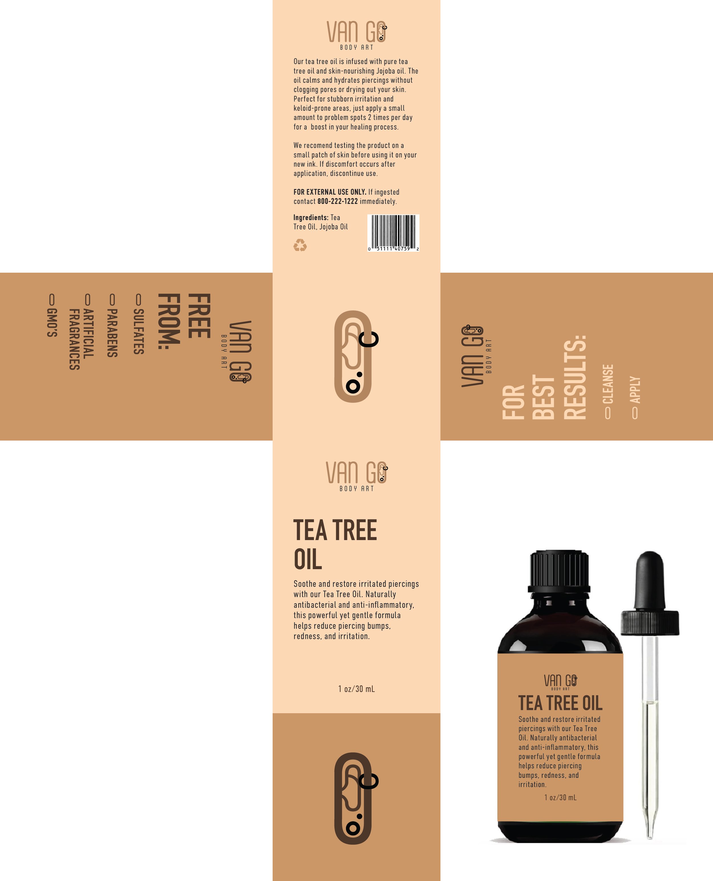
When I first started designing my packaging, I knew I wanted to include illustrations of tattoos and piercings on the boxes in some form. I also knew I wanted to integrate the colors from the logo, and make them feel very modern and high end. I also knew I wanted the labels on each product to match the box, and keep as much information as possible as many people don’t keep the boxes their products come in. I also decided to make each product black to stay cohesive with the branding. I ordered all of my products from Amazon, and painted the Saline Piercing Spray black to match.
To make sure my products stood out from different aftercare products on the market, I decided to make the illustrative patterns I wanted to include appear on the inside of the boxes rather than the outside. This combined the modern, minimalistic approach I was going for with the illustrative elements I wanted to include without making the two aesthetics clash. For the illustrations themselves, I decided to go with classic tattoo and piercing icons that are highly recognizable. For the tattoo designs, I referenced different tattoo flash sheet sets I found on Pinterest as well as tracing some of my own tattoos. The piercing shapes were also inspired by designs found on both Pintrest and Adobe Stock.


Products and Packaging
The Final
For the final products and packaging, I resolved many issues I first encountered including there being too much text on the boxes and labels, value issues with the information on the boxes, the shape of the box, and making sure the front of the box stood out from the rest.
I applied the labels as vinyl stickers to each product, and constructed each box using card stock. To achieve the look I wanted on the inside, I wrapped the other side of each card stock box with vinyl that had the illustrated designs on it.


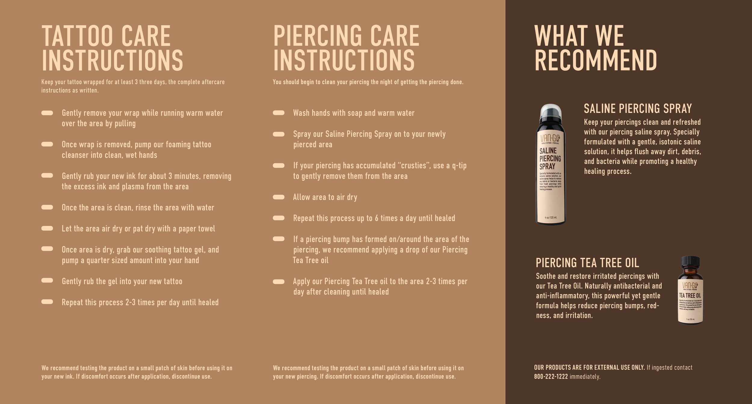
Aftercare Pamphlet
The Process
To begin my aftercare pamphlet, I compiled a list of different instructions from different examples I found from Google, Pinterest, and my own copies I had from previous tattoos and piercings. I went through and picked out which instructions fit best, and then started on the design. I knew I wanted it to match the aesthetic of the packaging, keeping the minimalistic approach with the same color scheme.
When I first began, I was using placeholder images from my label design file, and was trying to incorporate my pattern from the inside of my boxes onto the pamphlet.
Aftercare Pamphlet
The Final
The final pamphlet kept the same colors that I started with, but I changed some elements’ colors for readability and changed the size of the text for hierarchy purposes. I also decided to integrate the pattern on both the front and back of the pamphlet as a screened back pattern so that it felt cohesive but the pattern was no longer being read before the title text.


Print Ads
The Process
When starting to create my magazine ads, I looked at a lot of examples. I knew I wanted at least one of them to be featured in a wedding magazine, and at least one of them to showcase the brand’s reference of Van Gogh.
Print Ads
The Finals
For my final magazine ads, I kept the same three concepts but altered the amount of text on the ads and some of the design elements within the pictures.
I chose to alter Van Gogh’s self portrait to show him with tattoos and piercings, to reference the brand’s name. For the second ad, I made the ad for the wedding magazine showing two women’s hands with edited on wedding bands tattooed rather than traditional rings. Lastly, I chose to take a more direct approach and show the van design for the company with a catchy CTA that applied to a more broader audience.


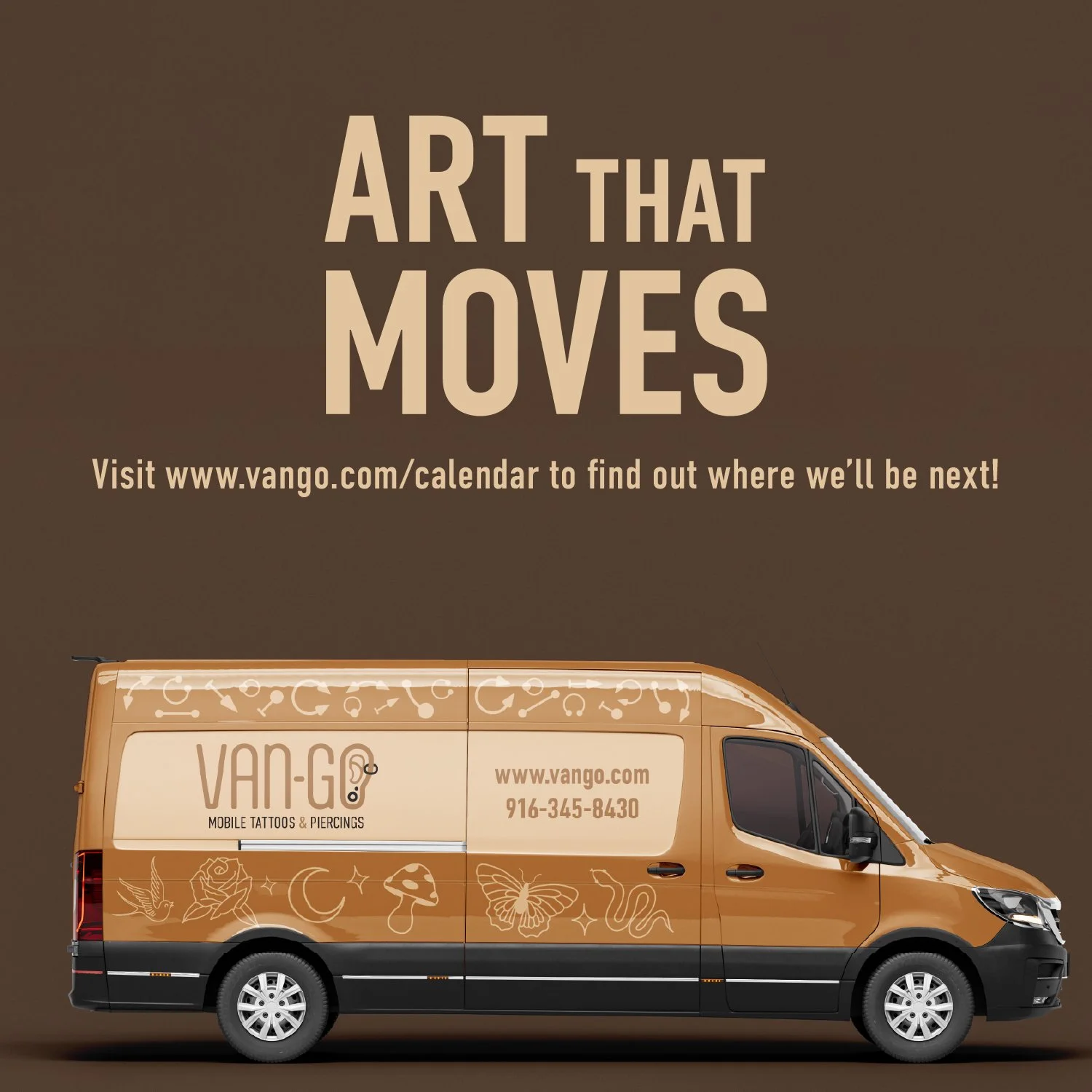
Van and Trailer Design
The Final
When designing the van and trailer for Van-Go, I made sure to keep all branding elements cohesive and include recognizable elements such as their color scheme and the pattern design seen throughout every other deliverable for the project.

The Final
For the mock Instagram account, I used a Figma template and decided to make the posts a combination of product images, informational posts, and web versions of the magazine ads. I also created small images for each story highlight that the company would have on their profile. To view the mock account, click below.


Web Elements
Final Websites
Desktop
Mobile